Does your campus web site suck too?
I howled when I saw this on xkcd, which I read regularly: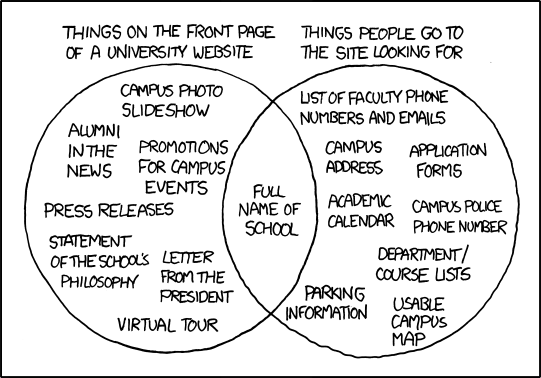
Nailed it!
I visit college web sites while advising future transfer students, and it is rare to find one that makes it easy to find what a student needs, even if they have a "prospective student" link on the front page. And our college web site is as bad as most. So it pleased me a lot to see IHE pick this up in a story Wednesday.
I really like the comment objecting to the "three clicks" problem for key information, and REALLY like the person who is taking this cartoon to every meeting of a CC website revision committee meeting.
But the funniest part was the observation about pictures of "pretty girls studying under trees" on the home page.
Does your college have a photo roll including ethnically diverse but atypically good looking students studying under trees? Ours does. Using computers? (Yep) Interacting in a small group with a distinguished looking professor? (Yep) A link that takes you directly to the academic calendar or the college's majors with a clear list of requirements? (Sort of)
UPDATE:
IHE has a followup story about efforts at web redesign that starts with the student. Interesting followup. I know our college web site has been redesigned to use pull-down menus that have a laundry list of possible links, but we simply do not have a "prospective student" category nor any sense that most of the links off the front are not used.
However, I also have to wonder if "prospective" is too fancy a word for many of our incoming students, the ones that place into developmental reading classes.

No comments:
Post a Comment